What is Courtside
Courtside is a mobile app that allows users to fully customize their sports experience by following the exact information they want to see. Users can follow their favorite sports, teams, players, and even individual stats.
The app is built with React Native (using the Expo platform) and Typescript on the frontend. On the backend, the Flask framework serves as our API and MongoDB is used for our database.
What is Courtside (Currently)
The app is beginning to have integration with the NHL data, and I expect that soon I will be creating new frontend screens to get that data in the app. The app also now has a theming system, which stores appearance data inside the device’s local storage.
This Week
This week was the beginning of our sixth sprint. While much of the team is transitioning to focus on the NHL data, I was able to turn my attention onto a feature that I’ve wanted to implement for some time: Dark Mode!
In addition to dark mode, I was also able to create a system that allows users to pick the app’s primary color based on one of the teams they follow.
Spooky Scary Dark Mode
Implementing dark mode into Courtside required a few different steps. First, I had to create a new React Context to hold the theme data and provide it to the rest of the app. This context object has two members: a string with the current theme and a method to update the theme.
From here, I created a component (inspired by Github’s theme selector) that allows users to select their theme. They have three choices: light mode, dark mode, and the system default * Pretty much every OS now gives users the option to choose between light mode and dark mode to use as default in the OS. . The value that they select is stored in the user’s local storage.
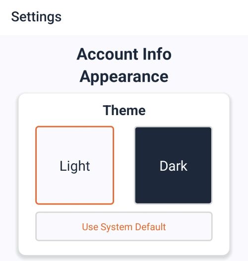
Theme Selector component
Finally, to allow the theme to be used throughout the system, I had to provide the user’s selected theme to React Navigation . React Navigation is the package we use for navigation components such as the bottom tabs on the main screen.
Bottom Tabs provided by React Navigation
Since navigation components are the base components of our app, they are able to take in a theme object (shown below), which will theme all the related React Navigation components.
const DARK_THEME = {
    dark: true, // whether or not this theme is a dark mode
    colors: {
        primary: '#EE6730', // the primary color of the app
        background: '#1e293b', // the color for the background
        card: '#334155', // the color for cards and headers
        text: '#f8fafc', // the standard text color
        border: '#272729', // the color of borders
        notification: 'rgb(255, 59, 48)', // the colors of popups
    },
};
Once this is implemented, I can use the useTheme hook in any component to get theme colors and just like that, our app is themed! Here is an example of the useTheme hook in our PrimaryButton component.
const PrimaryButton: FC<PrimaryButtonProps> = ({
    onPress,
    text,
    loading = false,
}) => {
    const { colors } = useTheme();

    return (
        <View style={styles.container}>
            <Pressable
                style={[
                    styles.btn,
                    {
                        backgroundColor: colors.card,
                        borderColor: colors.border,
                    },
                ]}
                onPress={onPress}
            >
                <Text style={[styles.btnText, { color: colors.primary }]}>
                    {loading ? <ActivityIndicator /> : text}
                </Text>
            </Pressable>
        </View>
    );
};
Finally here is a quick video showing the theme switching back and forth between the light, dark, and system themes.
Team Colors
After this, I wanted to give users the option to change the primary color of the app away from classic Courtside orange * #EE6730, which is the hex value of the color of a basketball . As a team, we decided that having users pick from the teams they follow would be a great idea.
Following the same steps as above, I first added a primary color string and a method to change the primary color to the context. Second, I created a component that would allow users to select a color from one of their followed teams (or Courtside Orange, of course!)
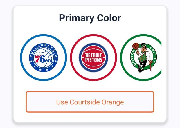
Color Selector component
Finally, I added a theme object property to the context, which would have all the default theme values and set the primary color to the color the user chose. This theme object is then plugged directly into the React Navigation navigator.
Themed Components
The last thing I did was create two generalized components that could be used throughout the app to provide theming on new screens. The first is the ThemeText component, which is a light wrapper around the native Text component that sets the text color to the theme color (or the primary color if that option is selected!)
const ThemeText: FC<TextProps & { primary?: boolean }> = (props) => {
    const { colors } = useTheme();

    let color: string;
    if (props.style
        && (props.style as TextStyle).color) {
        color = (props.style as TextStyle).color as string;
    } else if (props.primary) {
        color = colors.primary;
    } else {
        color = colors.text;
    }

    const style = [props.style, {color}];

    return (
        <Text {...props} style={style} />
    );
};
The second component is a Card component, which is a general container that is used to group information together, separate from the background. The card component uses the background from the selected theme and has padding and margins that will provide a standard visual style throughout the app. The cards also have a shadow (through the amazing React Native Shadow 2 package ) which helps it stand out from the background.
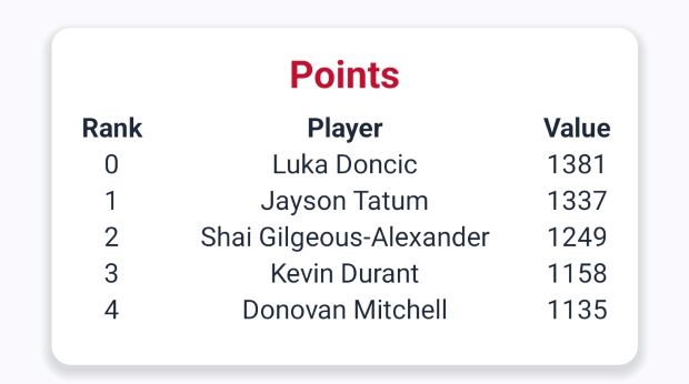
Stat leaderboard card
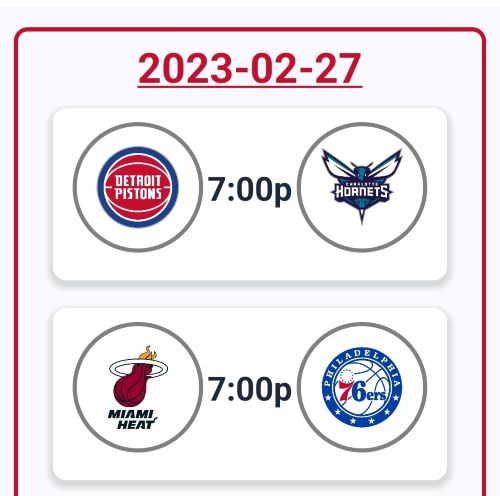
Game info card
These components are very reusable and are an easy way for other team members to incorporate themes into the screen they are making without having to dive deep into the system I have created.
Problems
This was a pretty simple and standalone feature, so I didn’t have many issues with it this week. One thing I wish I could have done is save the user’s appearance settings to the serve, so they would have the same appearance no matter where they access Courtside from. I just didn’t have the time to build backend routes for that, but I should be able to get to that next week!
Next Week
Overarching Goals
The main goal of this sprint is still the NHL integration. Rylee and Jake are working on implementing it into the database and backend. Once they have a way for us to programmatically connect to the data, I should be able to begin creating backend API routes and frontend functions that provide the data to the frontend.
Pet Project
I enjoyed messing around in the settings of the app this week and I think I want to work to provide more settings and configuration options. One thing that could be cool is having a way to send feedback to our team from within the app. There would be a separate page where a user could fill a text box with any complaints, and then an email would be sent on their behalf to our team. This would also be a fun way to build on my previous work with verifying user emails and the reset password flow .